I've built Vigilant, a monitoring tool designed to monitor all aspects of your website. From basic uptime checks to more advanced checks like performance. user flows and public infrastructure. It started as an open source project and is now a SaaS using the open core structure.
As a backend developer, design is not my strongest point. In this article I'm sharing the different revisions of the homepage and the feedback I've got from generous internet users with which I was able to improve the homepage a few times to what it is now. I'll share where I got the feedback and what I've changed.
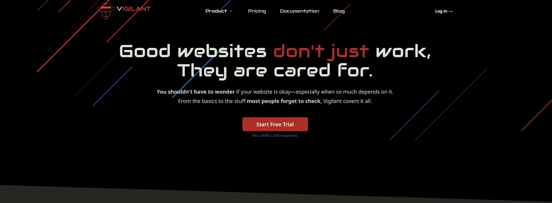
I won't make you scroll down the whole article to see the before/after, so here it is the initial version (January 2025) and (June 2025):
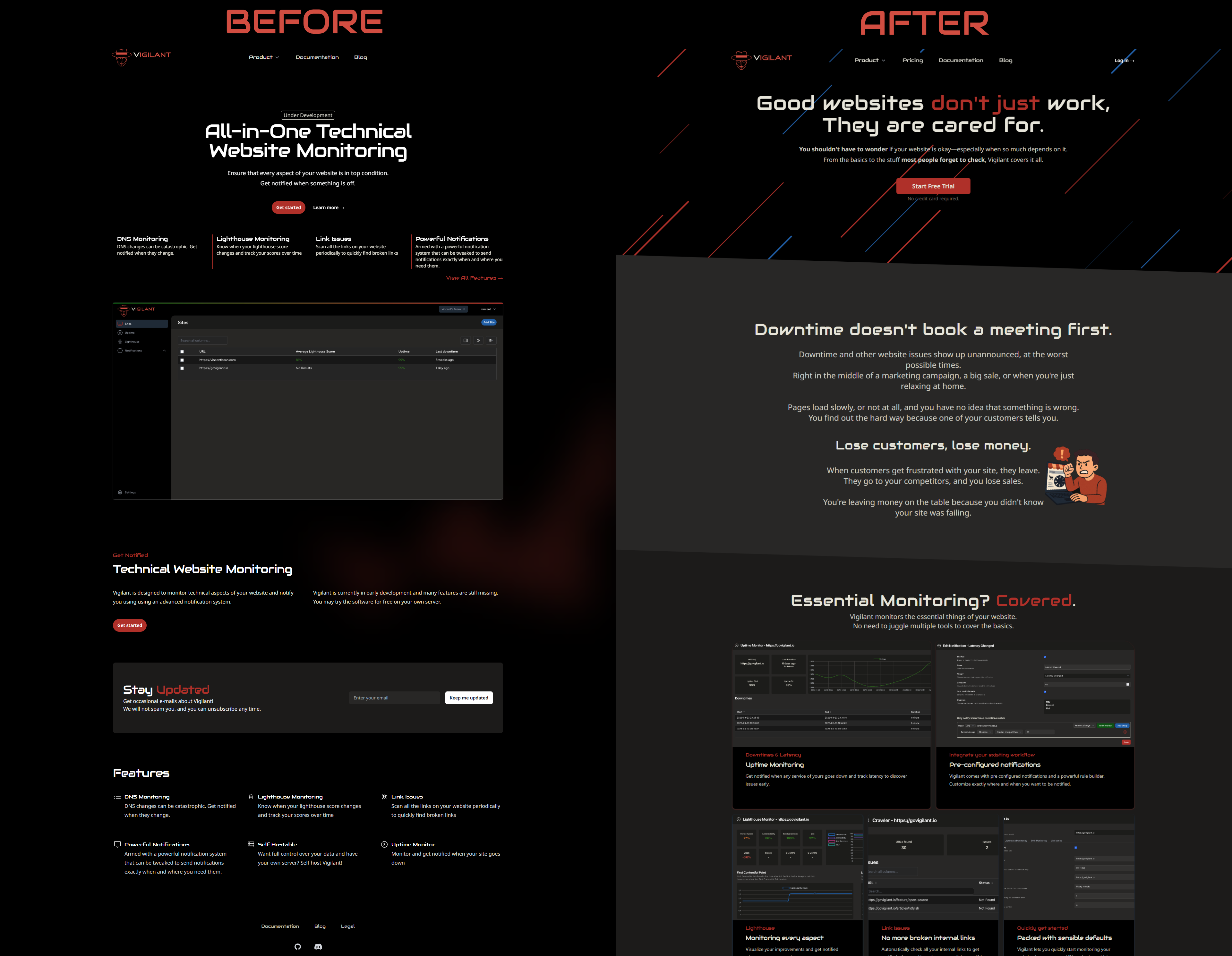
And now (November 2025):
The choice for dark mode
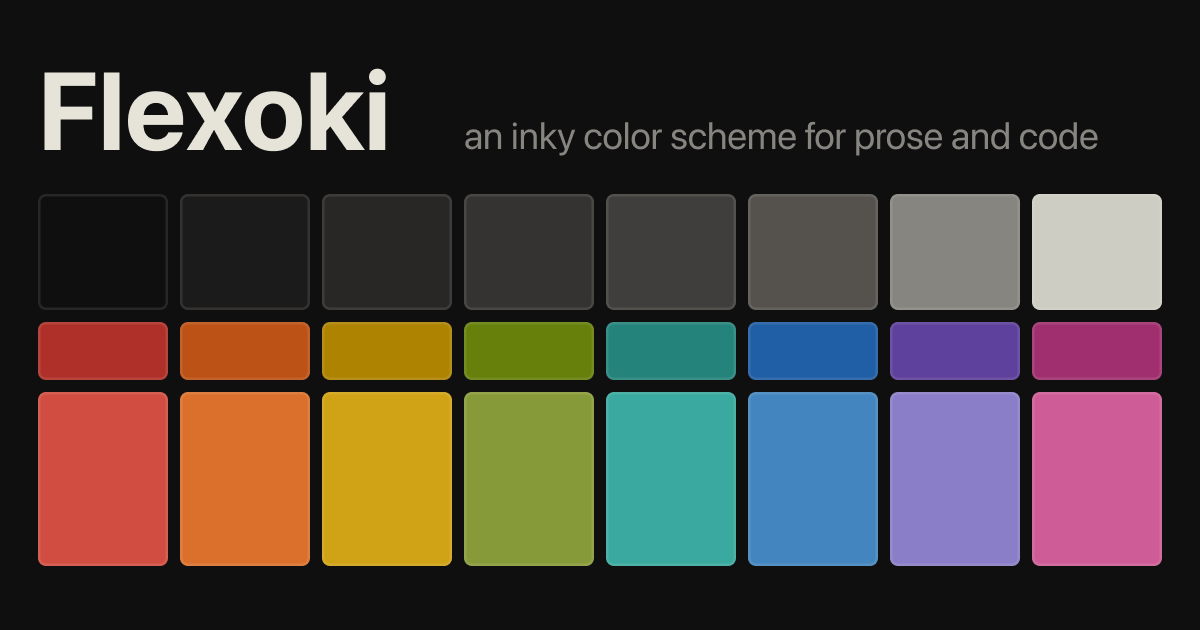
I had used a dark theme in one of my previous projects and decided that I wanted the same for Vigilant. Dark just has a cooler vibe to it in my opinion. I later learned that it is easier to make thing look nice on light mode, but I think I would still have made the choice for dark mode as it is my personal preference. Light mode would be cool to add in the future though. The color scheme I'm using is called Flexoki, which is open source and looks good in my opinion.
The Initial Version
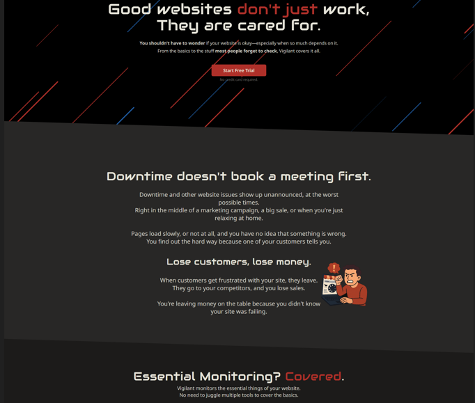
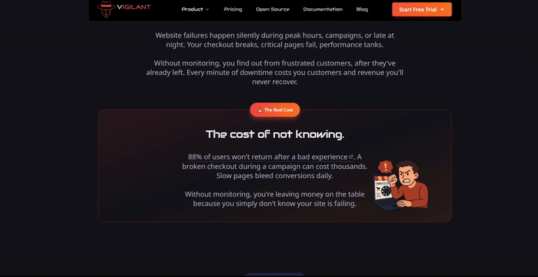
The initial version of the homepage was simple. There were two colours, black and red, a list of features and a screenshot. The goal of this website was just to have something, the most important part was the stay updated e-mail input. The project wasn't a SaaS at this point and if you wanted to use it you'd have to host it yourself (which is still possible today!).
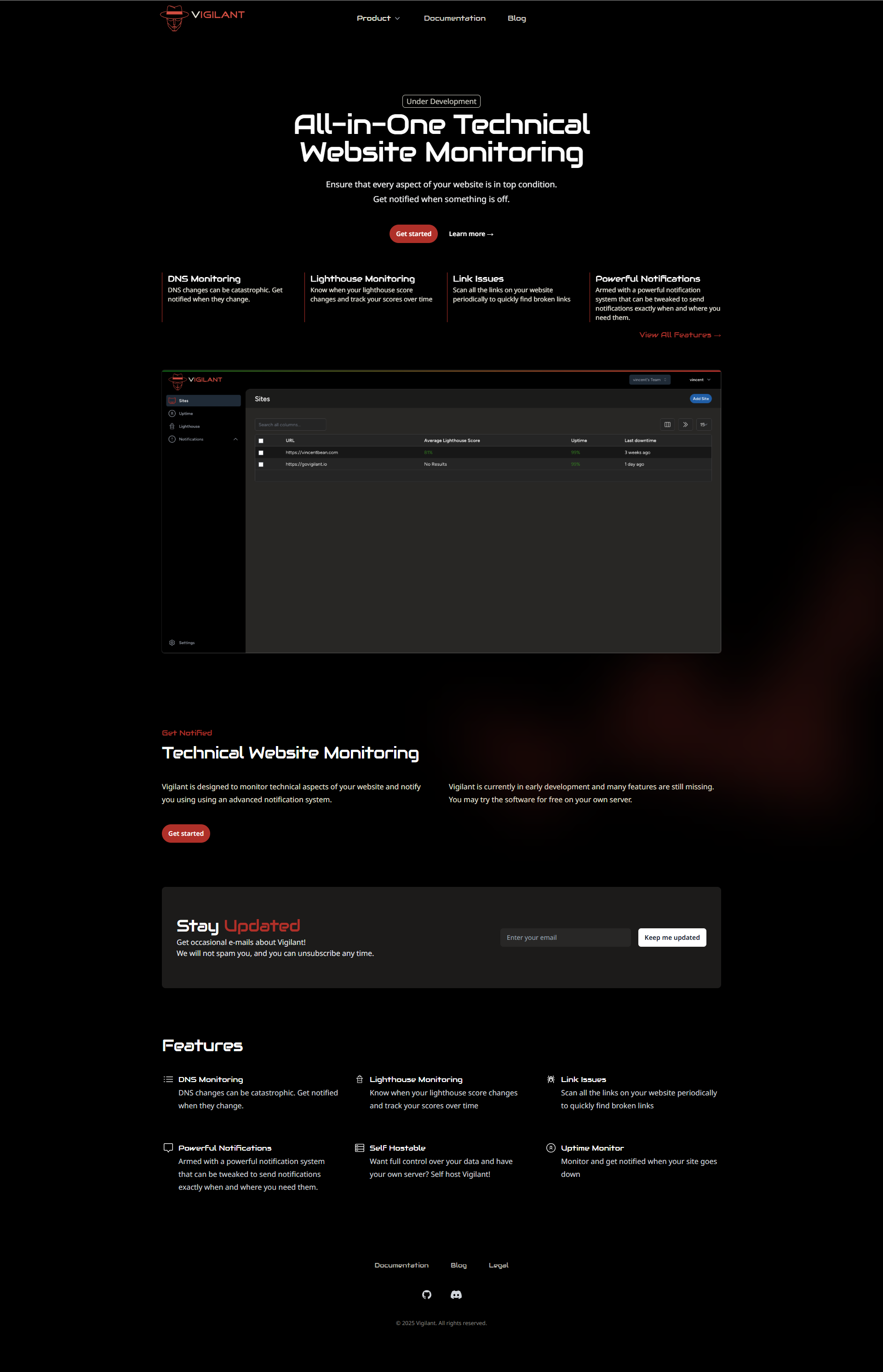
☝️ click to open the full screenshot!
This was fine when I started out, clean and simple but definitely not suitable for a SaaS homepage.
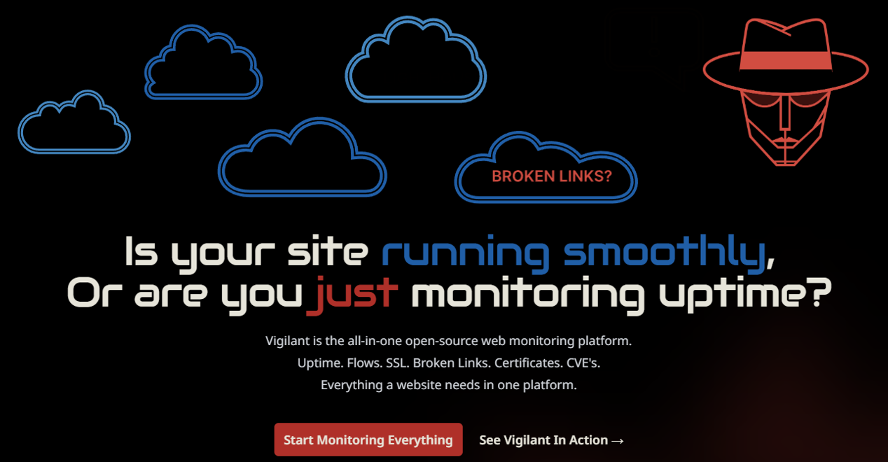
First redesign for SaaS
When I launched the SaaS version I wanted to make the homepage more appealing. I figured adding an animation would be cool, so I did. I've created this Lottie animation symbolizing how Vigilant works:
I had also changed the hero text to "Detect Website Issues Before They Cost You" and added the list of features in a bento grid with screenshots. Over time I've tried many different hero texts, I don't remember all of them but have learned that there are many good options and it's difficult to choose the right one 😅
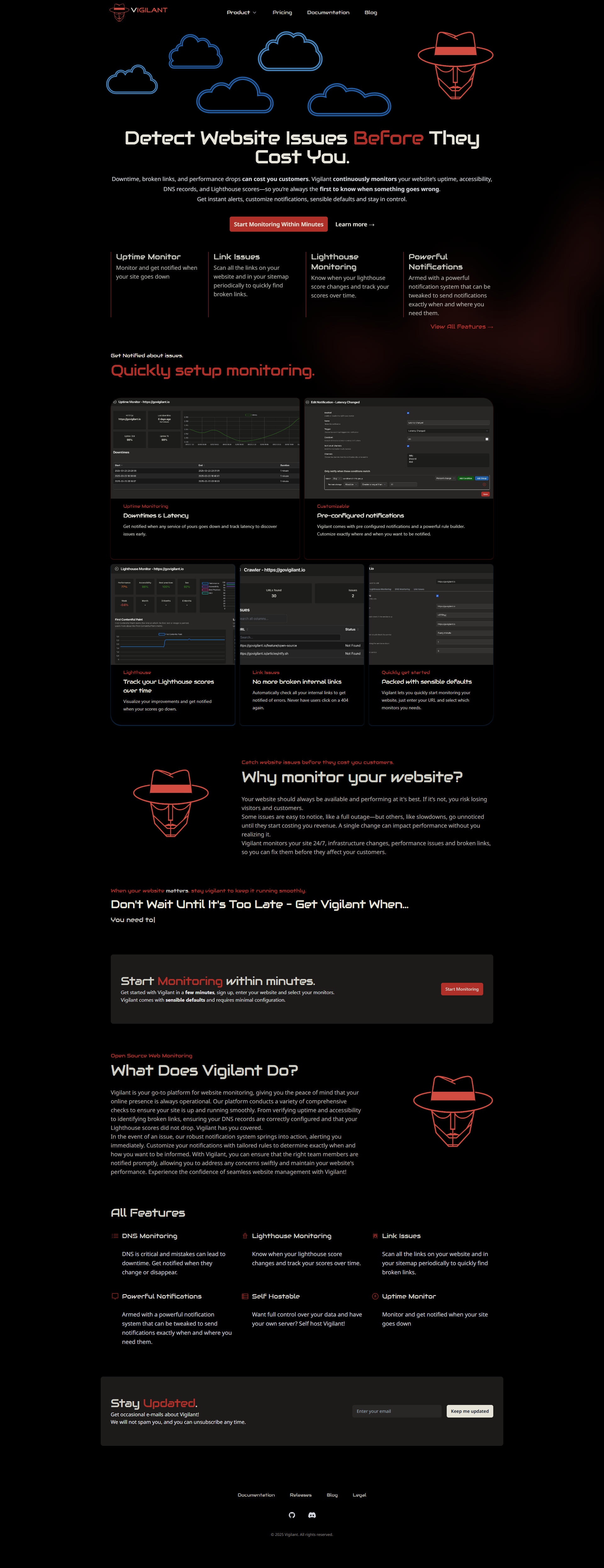
Up until this point I've not had any feedback and it shows. Two colors, reused the same logo image multiple times and hard to read screenshots.
First feedback
I came across a post on Reddit where someone was offering to review landing pages. Ofcourse I commented Vigilant and he made a video looking at the homepage and sharing his thoughts.
He commented:
As independent buy says - it seems like a website built by a developer with in mind what they like. some work to do, but the tool itself has potential.
This of course motivated me greatly, the video can be found here, but I'll here are his feedback points:
Design is rather simple but doesn't look bad
Colors are missing
Animation is funny but not professional
CTA is too generic
Copywriting is about the product, should be about the customer.
Anwser these questions: For who is Vigilant and what does Vigilant solve?
Screenshot doesn't tell anything
Use cases are missing
Around the same time I was chatting with another founder essentially told me the same, add more colors because there is no emotion now on the homepage. And the texts are about the product and not about the customer.
Applying the feedback
This feedback got me thinking. I started with the hero, I changed it to this and adjusted the text on the CTA button:
I went overboard with using colors in text, hoping that certain parts would stand out but in the end it was just too much.
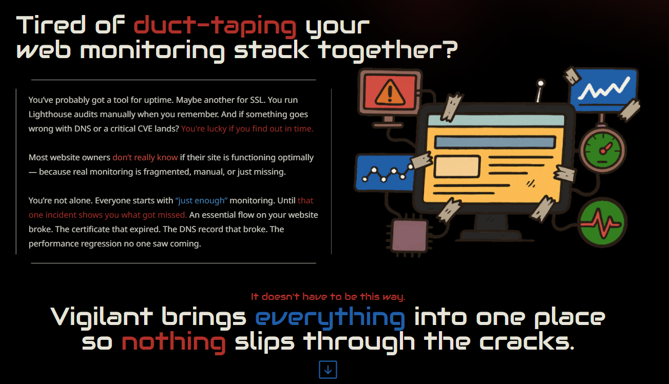
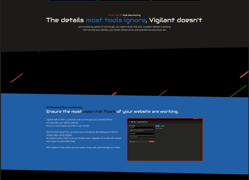
I had created an image that had to explain how Vigilant's flows feature works. I did so by arrows, small images and text. I thought that it was clear but after I looked at it a few hours later I noticed that it was actually very confusing. Would you understand this? No, you'd not waste your brainpower on this.
I had added colors, but just in the text. I've gotten feedback again on Reddit after making these changes which said that the red/green/blue were just too much and overwhelming. I also got the same feedback again, not enough color. It seems that I had failed in my mission to add color.
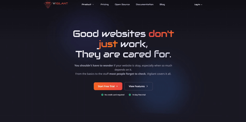
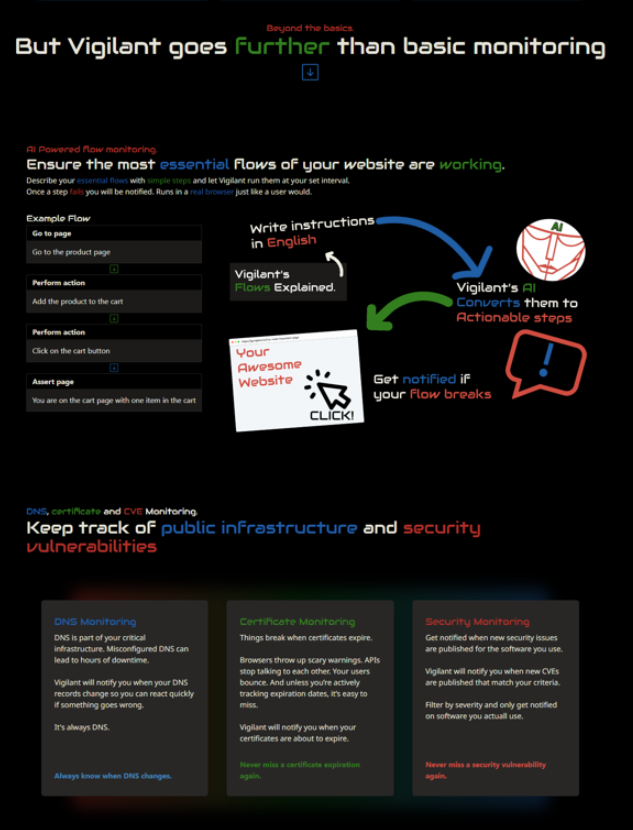
Adding color & animations
Instead of adding color on the page I changed the background color on some sections. Not too much, just a lighter base color from Flexoki but it looks much better like this in my opinion.
I removed the image with all the arrows for the Flows feature and replaced it with an animated GIF showing how it works. Because this is one of the most unique features of Vigilant I have made the background here blue so that it really stands out.
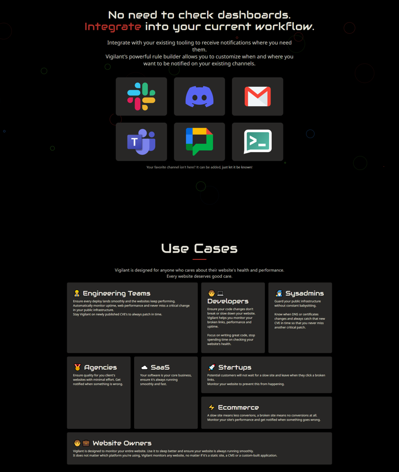
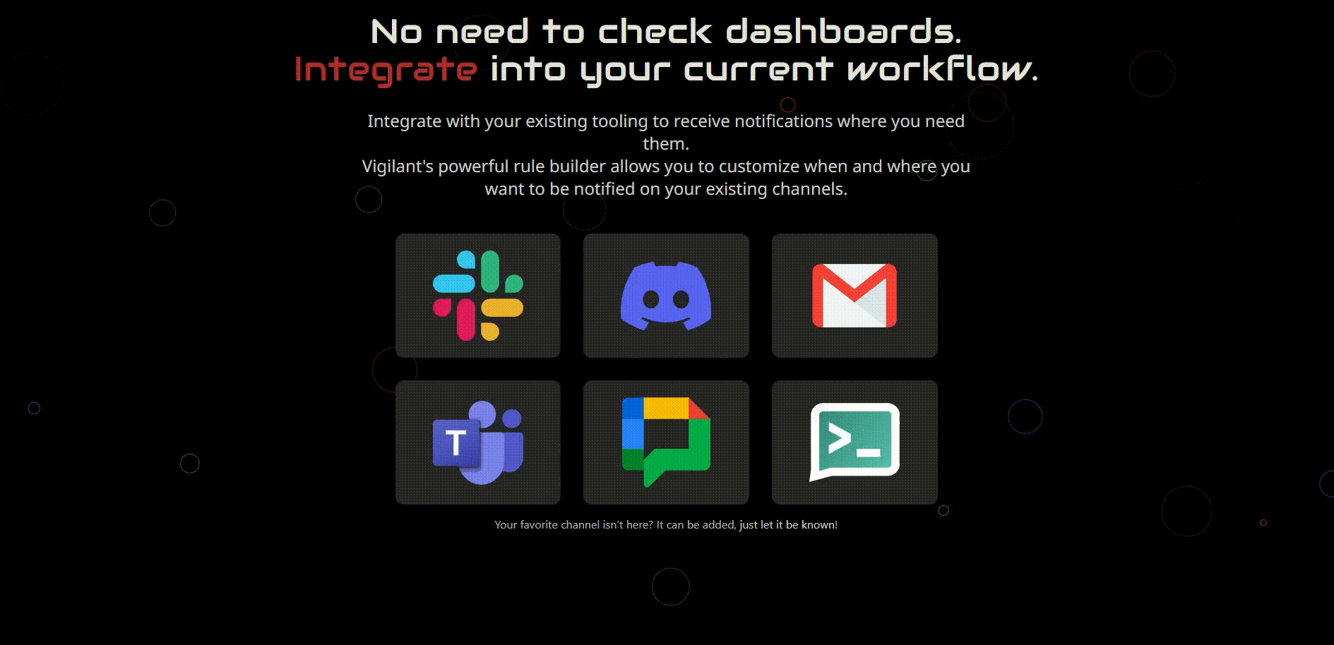
I had also added sections that highlight the notification channels and use cases.
To make it all a little nicer I added animations on three places. First of all the header, where I added moving stripes:
Then I added a little stripes animation to break up the page:
And finally I added little animated circles expanding behind the notifications, kind of simulating that you're receiving a notification.
The final solution: AI
The current version of the homepage is drastically better than the first version, we learn and improve. It's been a nice journey learning what to do and the feedback I've gotten from strangers on the internet has helped me enormously. I'd like to thank the people that took the time to comment and talk to me about the design, but realistically I know that they probably won't read this.
Anyway, my design skills are skill mediocre so I experimented with AI. I used Copilot CLI and entered this prompt:
This statamic website has been designed by a backend developer that does not have any experience in design. It looks terrible, you are an expert designer and are improving the design of this website. You may alter the colors slightly. Let's start by redesigning the homepage
And then I took it component for component and page by page through the AI. It looked much better and I even was able to add some nice face in animations and a cool hover effect on the hero.
In release 2025.11 I've also implemented this redesign in the application itself.
And that's it! It has been a journey but I'm very satisfied with the result.
I'm always open for feedback, if you see something that could be better, please e-mail it to me at [email protected] or join the Discord!